Most creative teams are stuck between two bad options: slow, expensive shoots or generic stock that blends into the feed. Stable Diffusion gives you a third way. It turns text and simple references into on-brand images—fast, cheap, and at a scale you can’t touch with traditional methods. This guide keeps it plain: what problem it solves, how it works in practice, and exactly how to get reliable, shippable results without becoming a machine-learning engineer.
Why teams get stuck—and what Stable Diffusion fixes
Creative bottlenecks usually come from time, cost, and consistency. You wait on talent, locations, weather, or design bandwidth. You compromise with whatever stock is “close enough.” You struggle to keep one visual language across dozens of assets and channels.
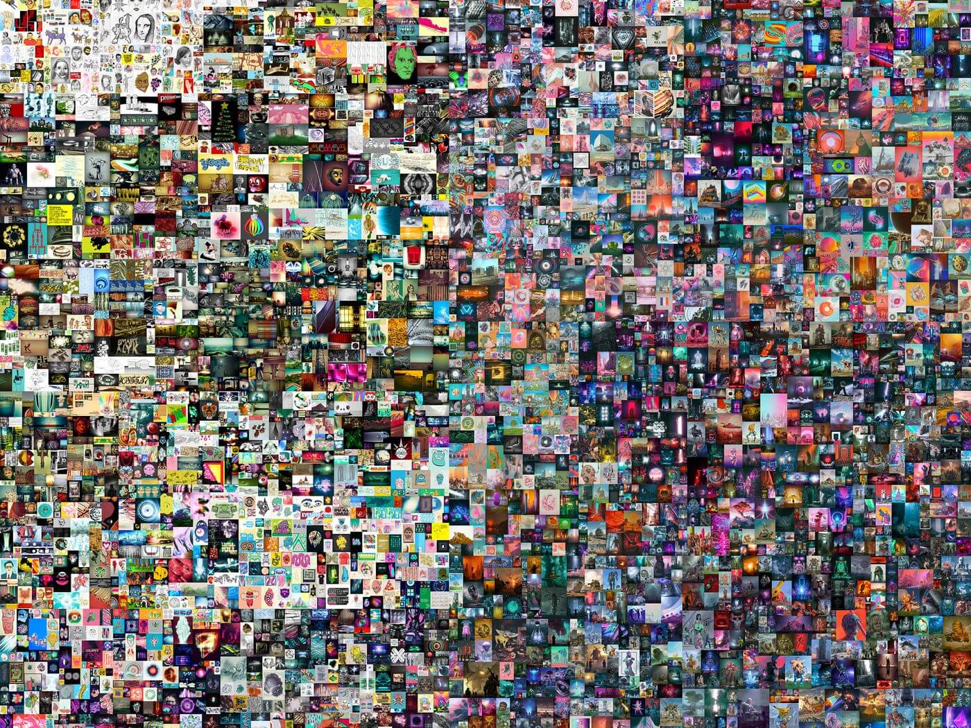
Stable Diffusion removes those constraints. It lets you explore concepts in minutes instead of weeks, generate dozens of variations from a single brief, and keep a consistent style across a campaign—even with different creators involved. It won’t replace real photography where you need literal truth, but it will slash your concepting time, increase output, and raise the quality bar for everything from ads and thumbnails to storyboards and product mockups.
How it works in plain language
Diffusion models work backwards from static. They start with pure noise and learn to remove it step by step until a meaningful image appears. Your text prompt is turned into vectors the model understands; those vectors guide how the noise gets “cleaned.” Under the hood are a few building blocks you’ll hear about:
- A text encoder that translates your prompt into meaning.
- A denoiser that iteratively sculpts the image.
- A compact image compressor (VAE) so this all runs fast on normal hardware.
- A sampler (the “path” it takes to remove noise) that trades speed for quality.
You don’t need to memorize the parts—what matters is that each one gives you control: how closely the model follows your words, how detailed the result is, and how fast you can iterate.
The ecosystem: tools and models that matter
You can run Stable Diffusion locally or in the cloud. If you prefer a visual UI, Automatic1111 is feature-packed and plugin-heavy; ComfyUI is a node-based “flow builder” that’s perfect once you want repeatable pipelines; InvokeAI streamlines the essentials; Fooocus adds guardrails for newcomers. If you’re a developer, the Hugging Face Diffusers library is the go-to for Python workflows and servers.
Model families matter. SD 1.5 has a gigantic community and tons of custom styles. SD 2.x shifted aesthetics and safety. SDXL is the current fidelity sweet spot—clearer text handling, better details, more photoreal options. Speed variants like “Turbo” and “Lightning” are fantastic for drafts.
You’ll also hear about extenders: ControlNet to enforce structure (poses, edges, depth), IP-Adapter to match a reference style or identity, LoRA and textual inversion for light-weight fine-tuning, and upscalers for the last mile of detail.
Setup in ten minutes: pick your path
If you have a recent laptop, you can run SDXL with conservative settings and upscale after. With a creator workstation (8–24GB NVIDIA VRAM), batch generation becomes snappy and you can stack ControlNet for precision. No-install options exist via cloud notebooks or hosted services; you trade fine-grained control for convenience.
Practical advice: start simple. Use SDXL. Keep a single “house” configuration you can share with teammates. Only add ControlNet, IP-Adapter, and LoRA when you hit limits.
From zero to first keeper: a fast recipe
Open your UI and set a baseline:
- SDXL model, 1024×1024, 20–30 sampling steps, DPM++ 2M Karras sampler, guidance (CFG) at 4–7, one fixed seed.
- Prompt scaffold: subject, scene, style, lighting, lens/angle, mood, composition cue.
- Negative prompt: remove the predictable junk—low quality, blurry, extra fingers, watermark, logo, text, deformed, artifacts.
Generate four to eight images. Shortlist two. Keep the seed the same while you adjust one thing at a time (lighting, pose, color), then unlock the seed for variety. This alone gets many teams to “good enough to show the client” within fifteen minutes.
Workflows you’ll actually use
You’ll spend most of your time in a handful of repeatable flows:
Text-to-Image for ideation. It’s where you find your look, mood, and composition. Batch a few, then cut.
Image-to-Image to keep layout while changing finish. Drop in a sketch, moodboard, or rough photo; set “denoise strength” lower if you want to preserve structure, higher if you want freedom.
Inpainting to fix hands, swap skies, add products, and remove distractions. Paint a mask only where the change is needed; keep the rest locked.
Outpainting to extend canvas for hero banners and social crops. You’ll keep typography and product safe zones while adding background visual interest.
Structure with ControlNet when composition matters. Use Canny edges for frames, OpenPose for people, Depth/Normal for perspective, Tile for high-res detail. You get realism without losing control.
Style match with IP-Adapter to stay on-brand. Provide a brand board or prior creative as a style reference and steer SD toward that look without heavy training.
Prompts that deliver (without guesswork)
The biggest prompt mistake is flowery adjectives stacked like a mood board. Say exactly what you need in plain language. Lead with subject and outcome. Add one or two concrete modifiers per concept: “three-quarter view,” “cinematic rim light,” “35mm,” “golden hour,” “top-down,” “isometric,” “studio seamless background.” If a bad artifact appears twice, add a negative prompt for it—otherwise keep negatives lean.
Order matters. Start with the thing that must be right (the shoe, the kitchen, the instrument), then add style and lighting. One or two style anchors are plenty; five will turn to mush.
Quality and consistency controls
A few dials do most of the work. More steps don’t always mean better; with SDXL, 20–35 is the sweet spot. Guidance (CFG) too low gives dreamy surprises; too high gets brittle and weird—start at 4–7. Generate near your target resolution and use a quality upscaler at the end. Stick to one sampler so your library feels consistent, and save your seeds and settings in filenames for reproducibility.
For brand consistency, use IP-Adapter with brand boards to lock palette and lighting. Use ControlNet for layout grids and repeatable compositions. If you need a recurring character or product identity across hundreds of assets, train a small LoRA; it’s often 15–50 images and a lightweight file, not a whole model.
Speed, cost, and scaling up
Treat images like software builds. Invest in a strong brief and a first prompt that’s 80% right. Then batch variations, shortlist quickly, and only polish the winners. Use Turbo or Lightning for rough review rounds and switch to your standard sampler for finals. As volume grows, ComfyUI graphs or Diffusers scripts can render every required aspect ratio and platform size in one pass.
Editing, motion, and hand-off to production
Use inpainting for content fixes, then an AI upscaler for crisp detail. Finish typography and precise color in your DCC tools: Photoshop for compositing, Figma for layout, Resolve or After Effects for motion. For subtle realism—shadows, reflections—blend a quick Blender pass beneath your SD render and composite. Ship with a tidy export: sRGB, correct compression, alt text if required, and a small QA check for artifacts.
If you need motion, don’t wait on “perfect” video diffusion. Storyboard with SD lookframes, create gentle parallax, pans, and zooms, and combine with clean motion graphics. You’ll have high-impact social assets this week, not next quarter.
Guardrails: safety, rights, and compliance
Three rules keep you out of trouble. Don’t use real people’s likeness without consent. Don’t reproduce copyrighted characters or logos. Disclose AI assistance where it’s material to claims or required by platform/policy. If you fine-tune, favor licensed or opt-in data. Mind regulated categories (health, finance, claims). These are common-sense steps that protect your brand and keep your output usable everywhere.
Debugging typical artifacts
When hands or faces go strange, lower denoise, switch to a sturdier sampler, and inpaint those regions with a couple of targeted variations. When text shows up as gibberish in an image, stop trying to “render text” in the model—set space for copy and add it in design tools. When images turn muddy, reduce stacked styles, lower CFG a notch, try your alternate sampler, or generate larger and upscale cleanly. If colors slip off-brand, include palette terms or feed a reference to IP-Adapter and color-grade after.
A lightweight team playbook
You’ll scale quality by standardizing three things: prompts, settings, and review. Keep a shared prompt library with real examples for your common use cases. Maintain a one-page “house settings” sheet: model, sampler, steps, CFG, negative list. Create a simple QA checklist that every asset must pass—anatomy, artifacts, brand colors, legal check, export specs. Track a few metrics that matter: time to first approved concept, number of rounds per asset, asset reuse rate, and the lift in CTR/CPA compared to old creative or stock.
Use cases by role
Marketing teams churn out ad variants, landing heroes, email headers, event visuals, and seasonal campaigns without waiting on constrained design queues. Product teams generate feature illustrations and onboarding art that match the UI. E-commerce mixes studio product shots with generated environments, swaps colorways, and fills banner libraries. Architecture and interior teams iterate moodboards and façade studies with depth-guided control. Education and nonprofits build inclusive posters and explainers quickly and at low cost.
Quick demo: from brief to final
Imagine a fall campaign for a running shoe. The brief calls for an energetic, urban sunrise look with your brand’s warm colorway. You prompt SDXL for a three-quarter shoe close-up on a wet street with soft rim lighting and a wide-angle feel. Eight images appear; two are close. You inpaint laces and the toe box, swap in a softer sky, and use ControlNet Canny to keep the composition as you test alternate backgrounds. You upscale 4×, crop for 4:5 and 16:9, and bring the image into Figma to add the headline and CTA. A QA pass catches a small reflection glitch; a quick inpaint fix clears it. The entire cycle—concept to final—takes an hour, and you leave with three strong variants and a saved seed/settings log for future reuse.
The takeaway
Stable Diffusion isn’t about replacing photographers or designers. It’s about removing bottlenecks, raising consistency, and giving your team a controllable engine for ideas and production-ready assets. Start with SDXL and a single house preset. Add ControlNet and IP-Adapter when composition and brand style matter. Use inpainting and upscaling to finish. Standardize prompts and settings so anyone on your team can get repeatable results. Then measure the creative lift—time saved, rounds reduced, and performance gains in the wild.